SEO is changing, and Google is much smarter than it used to be!
Mobile-first indexing and fast loading speed for your website are creating lots of buzz. Google has started the process of migrating sites to mobile-first index from March 2018 and it will be at core of all SEO trends in 2019.
If you want to ride these waves of change, you better get adopted with your SEO strategy in advance.
Google first introduced mobile-first indexing at the end of 2016 and now it ranks websites based on how they appear on mobile devices.
[bctt tweet="Pretty much, SEO is now about optimizing for ‘Mobile SEO’." username="relevance"]
Mobile SEO: The process of optimizing a website for users with mobile devices- smartphones and tablets. This also includes making your site resources accessible to search engine spiders.
The Importance of Mobile SEO: The number of mobile searches is promising. More than 58% of all searches on Google are done from the mobile devices, which simply means mobile users are surpassing the desktop users.

Source: https://backlinko.com
The mobile search trend is growing fast. As per Google, there are 27.8 billion more search queries performed on mobile devices than desktop in the US.
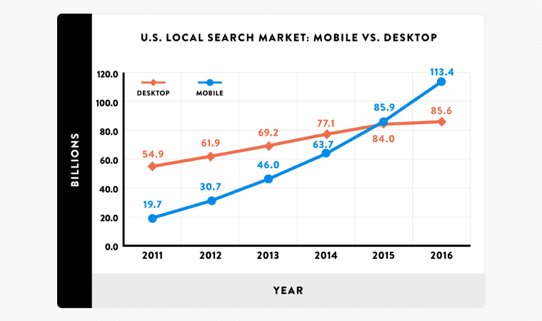
Source: https://backlinko.com
This clearly indicates that the mobile is the future of search. You cannot ignore the importance of mobile SEO if you want to achieve better search results to your website or blog in 2019.
[insert page='email-marketing-subject-lines-why-they-can-make-or-break-your-email-marketing-campaign-and-what-to-do-about-it' display='single-related-article.php']
[bctt tweet="User experience matters above all for users as well as for the search engines." username="relevance"]
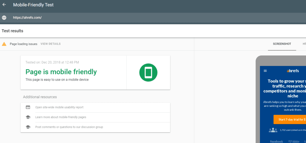
You need to understand user’s intuition to serve better user experience. Spend some time reviewing your website’s layout and design and then need to adjust it to make it more engaging for mobile users. These qualitative factors aren’t easily detectable. However, you can use Google’s tool to test your website for mobile devices.
Make your content consistent across mobile and desktop, which applies to:
Create and adjust your content for mobile-first indexing not for the desktop-first indexing. If you create content for desktop-first indexing, then Google won’t be able to index your website. It has become a thing of the past!
Link your posts and pages internally and make it accessible for mobile users and search engines. However, internal linking doesn’t have to be the same for desktop and mobile, just make sure the content is accessible for both- desktop and mobile.
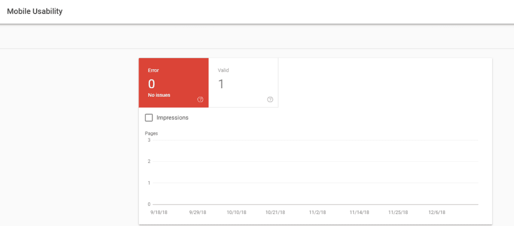
Use Google Console to check the usability of your mobile site. If it passes the test, then your site is good for mobile users or otherwise, it needs to optimize for mobile devices with suggested improvements.
Think about the user experience on mobile. Place hamburger and accordion menus on your site and make sure that your desktop and mobile site have the same primary content. Don’t forget to include structured data on your mobile site as it is one of the biggest rankling factors by Google for indexing your mobile site.
This is the most important thing to do when creating a website. A website page’s layout and content respond to each individual user with a responsive design.
[bctt tweet="Responsive design serves the best SEO advantages to a website as all your content is on a single URL, which is GREAT for sharing and getting links." username="relevance"]
It gives you a minimum headache as you don’t need to worry about duplicate content for your mobile or desktop version and that’s why there is no pain for inserting “rel=canonical tags”.
There will be no redirects with the responsive design. Redirects cause technical SEO issues and slow down your website. Also, responsive design is insanely user-friendly, thus give amazing user experience.
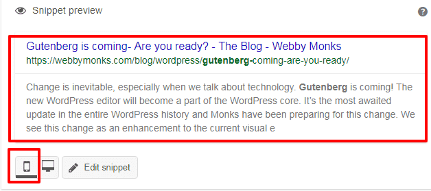
Check-out your content fits well for the mobile snippet. How your content appears on the mobile search results matters a lot. Thus, you need to make sure that the search results show the appropriate information in search results on mobile devices.
Take help from the SEMrush Sensor tool to analyze your audience behavior for desktop and mobile devices.
The tool will give you comprehensive data on how people are performing searches on their mobile and desktop devices. It will help you make your site ready for the desktop and mobile devices.
[insert page='how-to-combine-email-and-content-marketing-for-increased-success' display='single-related-article-02.php']
Here is the BIG deal! You need to understand your audience and their intent. What they prefer- text, voice, audio or video.
[bctt tweet="When optimizing your website for mobile devices you must think of your users first." username="relevance"]
This means you need to think about user’s queries above the keywords.
Now people don’t search for information the way they type or search using voice command. They simply ask questions. People use natural phrasing and longtail keywords to search the desired information. Most of them are in the form of questions.
The voice search is revolutionizing the way Google shows search results. This is going to transform the future of search- as per the comScore, 50% of all searches will be done through voice searched by 2020.
To show right results to the user’s query you need to shift your focus from search engine optimization to answer engine optimization.
Therefore, you need to find questions to optimize your site pages for mobile devices instead of focusing on keywords alone.
Your website speed is a major consideration when it comes to optimizing for search engines as well as for better user experience.
[bctt tweet="If your website is slow then users will get frustrated and find other alternatives easily." username="relevance"]
Also, slow website speeds affect search ranking on major search engine.

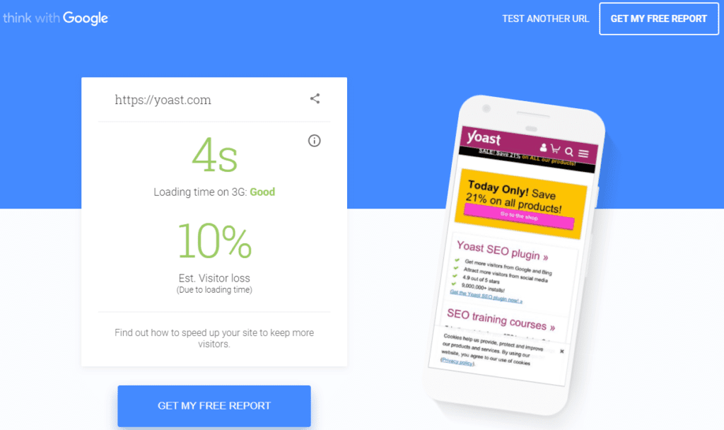
Test your site speed using Google’s tool for testing mobile website speed and performance. Here you’ll get a free report on your mobile website’s speed and performance. Test your website and get a complete report on your email with suggestions for improvement. If you want to stay in the competition, then you need to optimize your mobile website speed within 5 seconds.
Optimize your site content and use a reliable caching plugin (W3 Total Cache). Also reduce the content to minimum for mobile devices. Properly optimize images and give alt. text to each images on pages and posts. Also, shrink images using a suitable image compressing plugin such as WP Smush.
To increase your mobile site speed Google AMP can be useful as it can increase 4 times your site loading speed on mobile devices.
Implement these things to minimize your website loading time and make your users happy with the better experience.
[insert page='5-blockbuster-seo-trends-for-2019-and-beyond' display='single-related-article.php']

Source: https://bit.ly/2Bunlmm
Any interruption on your desktop or mobile screen can break the user experience. You got it right, yes, it’s about pop-ups that certainly oozes on mobile and desktop screen. Google disregard mobile pages with intrusive pop-ups.
Also, interstitials make your site slower due to third party resources outside of your server.
[bctt tweet="Avoid pop-ups on your mobile screen especially those that don’t add any value to the content." username="relevance"]
The guide provides you with crucial and easy-to-implement tips for optimizing your site for mobile viewing. Implement these SEO strategies to boost your mobile search traffic.
Boost your traffic with mobile SEO and win more customers for your business.