A problem often faced with display advertising—be it graphic banners or dynamic AdSense or Chitika ads—is getting users to click and, once clicked, to act upon the offer (i.e., convert).
According to PageFair, worldwide usage of ad-blocking software has increased by 41 percent in the last 12 months. This, in addition to the fact that 54 percent of users don’t trust display ads enough to click on them. Moreover, a 2013 study by Pew Research Center reported that 28 percent of survey takers hid their online activities from advertisers and not just hackers.
In other words, web users are very aware of their privacy and they are scared of personal data collection.
To that, add that only 2.8 percent of website users find ads on website relevant, according to a study by Infolinks and bannerblindness.org.
It’s crystal clear that making the ad a mere link to the website homepage or another page containing no CTA is a wasted opportunity. You want a CTA on the ad and one on the landing page.
In fact, display advertising converts better when you use calls-to-action in a similar fashion to the way bloggers do. They add banner offers at the end of blog posts that lead to landing pages where the offer is described in detail, all the better if it’s a freebie or given as a free trial. In other words, they present something that users can grab for free to ‘taste’ the product or service before they decide to purchase it.
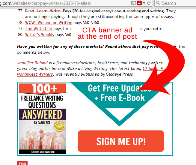
End-of-post CTAs at Make A Living Writing are a good example in this sense:
 Photobucket‘s very alluring banner is also effective:
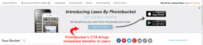 And take a look at their landing pages. They flow directly from the banner ad as if you were turning a page of the same book.
“The process needs to be seamless”, explains David Leonhardt from Ghostwriters for Hire. “Whatever the ad says needs to be continued, if not expanded upon, in the landing page. The landing page must build on the expectations raised in the ad. The two are one, symbiotic.”
So, how exactly can you use CTA banners and landing pages to get users to click and convert? More specifically, how can you encourage users not to stop engaging after the first click (on the banner) and to proceed to the second click (on the landing page) that gets them to grab your offer?
Here is the opinion and advice of people who have a good deal of experience with display advertising, CTAs and landing pages.
Banner & Landing Page Buttons: Use Colors & Words Wisely
“The first thing I would do is to make sure that the CTA stands out,” says Vince Comfort. “The easiest way to do that is by giving the CTA text or button a bright color that stands out from the rest of the page.
“If you can provide instant access to whatever you are promoting, it is a good idea to include the phrase “instant access” in your CTA. I was offering a free ebook and the first CTA read, ‘Get your Free Download.’ Then I changed it to ‘Get Instant Access Now!’ and clicks instantly doubled.”
After the Click, Landing Pages are What Converts
Raymond Duke, digital marketer and author of “How To Write, Design, And Create Landing Pages That Convert In 2015,” explains, “The single most important thing that will determine whether or not your landing page is mediocre or a smash hit is having a BIG idea. A big idea is something unique, different or new about your offer—something that is so compelling for your target market that they cannot resist taking action on your landing page.”
Joe Preston also shares tips on product placement in landing pages and advises to “put multiple product offers for distinct products that are targeted to the audience.”
He goes on to explain having had great success with landing pages that:
- Offer multiple “listings for services” (great if you have advertisers in the vertical)
- Present informative clickbank products that are on target
- Offer a newsletter signup
- Provide a search box for access to additional targeted listings (and ads)
Irina Weber from SE Ranking sheds light on the importance of how people come to your banner ad and click:
“I think the make-up of landing pages can also be designed based on how someone gets to a webpage. For instance, getting there in response to a direct mail campaign may imply a different mindset than someone who comes to a website via a social media link.
“My tip for eCommerce sites is to look at the abandon rates from your checkout funnel, by source of the visitor.” Weber adds, “In particular, the abandon rate between the cart and the first stage of the main checkout process. Sources of visitors who get so close to buying are much more promising than sources which don’t even get that far. Those sources deserve some investigation.
“GA Custom reports and custom dashboards are great for this since the goal abandon rate doesn’t show up in standard reports. A ‘micro funnel’ with just the cart to checkout stage works well. A dashboard widget showing that rate by source/medium can be really useful if you include ‘funnel starts’ as the first metric so you only see high-volume sources.”
[xyz-ihs snippet=”Agency-Link”]
Let’s Talk Freebies
Louie Luc from Buzz Nitrous tackles the freebie problem and how to offer it on your landing page.
“Personally, I would set up a landing page with an opt-in form to collect visitors’ email addresses, offering a freebie in return,” he explains. “Or, at the very least, I would get them to follow me on my social network profiles. It should be a very targeted freebie concerning their interests. It should also be easy to read and have a compelling title to entice people’s attention (e.g., 17 High-Converting Landing Page Ideas Top Marketers Are Using Today To Make Millions.)
“Why collect people’s email addresses? Because you would then have the golden opportunity to keep them coming again and again—for free—to your content where you’d gain their trust, continue to promote your products and have better chances of converting. Needless to say, my ad would mention the exact same thing I would promote on my landing page and be precisely targeted to an audience interested in that topic.”
From Planning to Campaign
It’s all too easy to create a banner ad without a CTA that redirects clickers to a standard homepage. It’s also easy to add a generic CTA to the ad without satisfying the user when they reach the landing page.
It’s not nearly as easy to create a banner with a CTA that flows seamlessly to the landing page, where the user finds the real CTA that leads them to get what they’re looking for… but that’s when your ad really converts and you get a high ROI for every cent you spent.
The choice is yours, but I do hope you’ll take the challenge, spend the resources and commit to better, more effective display advertising.
[xyz-ihs snippet=”Hubspot-CTA-Leaderboard”]