When designing a webpage, you will come across all sorts of useful advice – chief among which is the emphasis on designing intelligent, eye-catching, and effective calls to action.
It may seem simple enough – just add a little button somewhere on the page.
However, since we digital marketers love to work with data, test out different kinds of solutions, and come up with a list of different options, we have applied our meticulousness to CTA design as well.
Here’s what we have learned about designing CTAs that actually work.
Emphasize Your Biggest Selling Point
To be as effective as possible, your CTA should clearly highlight the key features of your product or service and focus on your biggest selling points.
If the selling point in question is that you have built up an incredible community of people who support each other’s goals (for example, if you are a gym), a CTA like “Join our community today” or “Join us today” would work great.
The most widely used selling point is a free trial. So if you offer one as well, noting that in your CTA can be a great conversion-boosting tactic.

Source: formsonfire.com
Here’s an example from Forms on Fire, which has a neat red CTA button above the fold with a simple yet effective “Try it free” – which is all you need in a CTA, really. Short and sweet and to the point.
[insert page=’8-factors-to-consider-in-user-interface-design’ display=’single-related-article.php’]
But Not Necessarily with the CTA Itself
Maybe you don’t want to use a “try it for free” kind of CTA. Or maybe there is no way to merge your biggest selling point with your CTA.
If that’s the case, an added banner or other neat design feature may help you boost the message of the CTA without having to get too wordy. Plus, you won’t have to break a sweat trying to figure out a way to say something that won’t really fit into your limited-sized button.

Source: ultimatemealplans.com
Here’s what we mean. The Ultimate Meal Plans homepage has a “Sign Up” CTA above the fold. However, their main selling point is that they offer a 30-day money-back guarantee. Not something they can actually put in the CTA, is it? So, they’ve come up with the clever bubble noting this feature, which pairs nicely with the CTA itself.
Brand It if You Can
Another great way to make your CTA stand out is to include the name of your brand or the name of your product. This will help you emphasize your brand’s identity and establish a deeper connection between your business and your audience.
You don’t need to brand every single one of your CTAs. Sometimes, all it takes is branding the buttons on your pricing or features page, and you can keep all the rest of the minimal and more neutral.
Wording like “Get NAME OF BRAND today” or “Sign up for NAME OF PRODUCT” is a great way to achieve this effect.
Prezi does this nicely, with their “Prezi Present,” “Prezi Video,” and “Prezi Design” buttons.
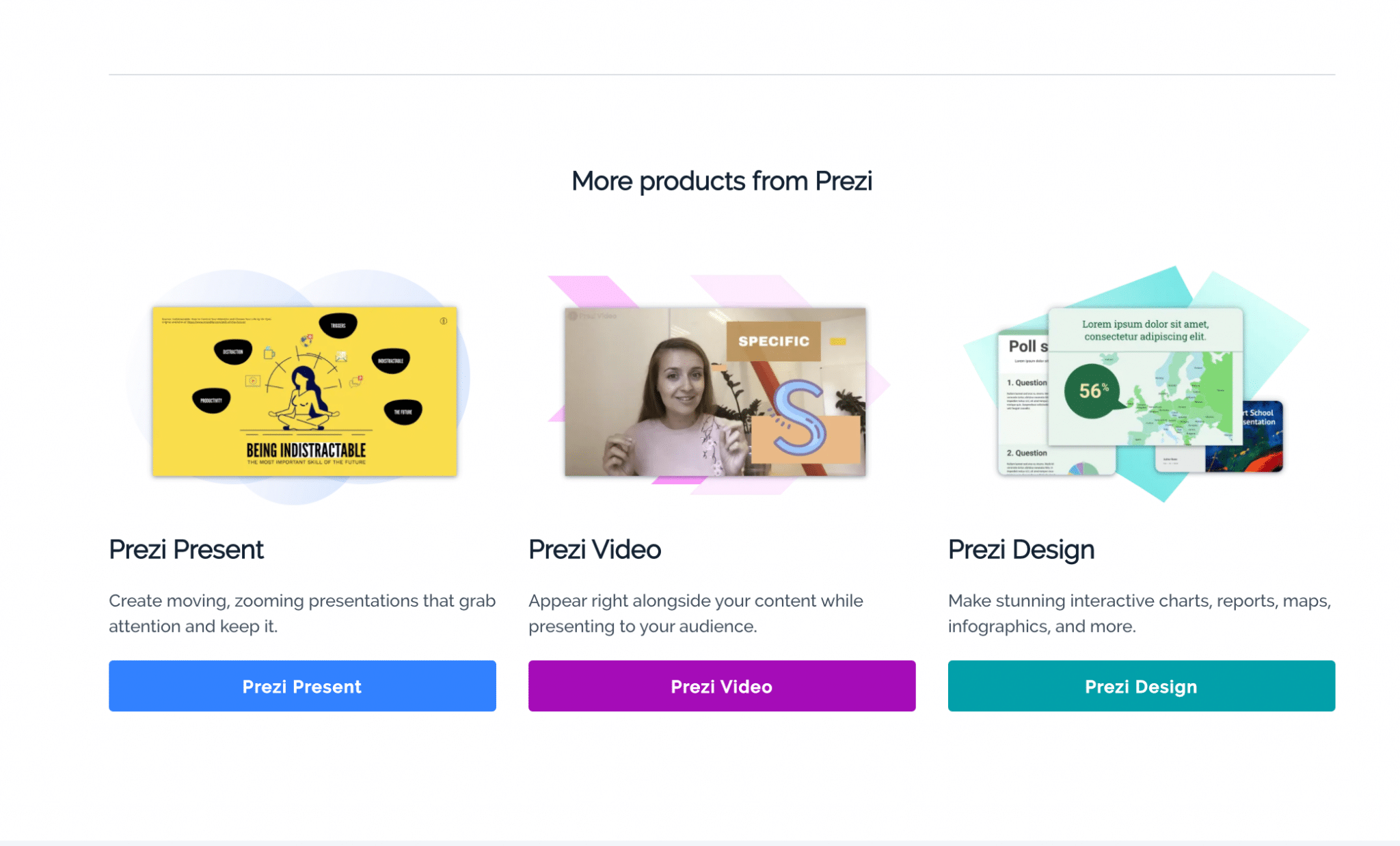
Source: prezi.com
Branding their services like this is not exactly unique, but it helps reinforce the name of the brand, ultimately helping it stand out in the minds of its users.
Offer More than One Choice
Sometimes, you want to highlight more than one feature of a product, or perhaps you want to offer two different kinds of services at the same time. Instead of choosing just one option and going for just the one CTA, you can add two distinct options and ensure all of your customers easily find what they’re looking for.
For example, if you offer a service both in-store or delivered, you might want to offer a choice right off the bat, without prioritizing one kind of customer.
A good example here is what Bark Box has done with their homepage – you can choose whether you want to sign up for their service yourself or send a gift to someone else.
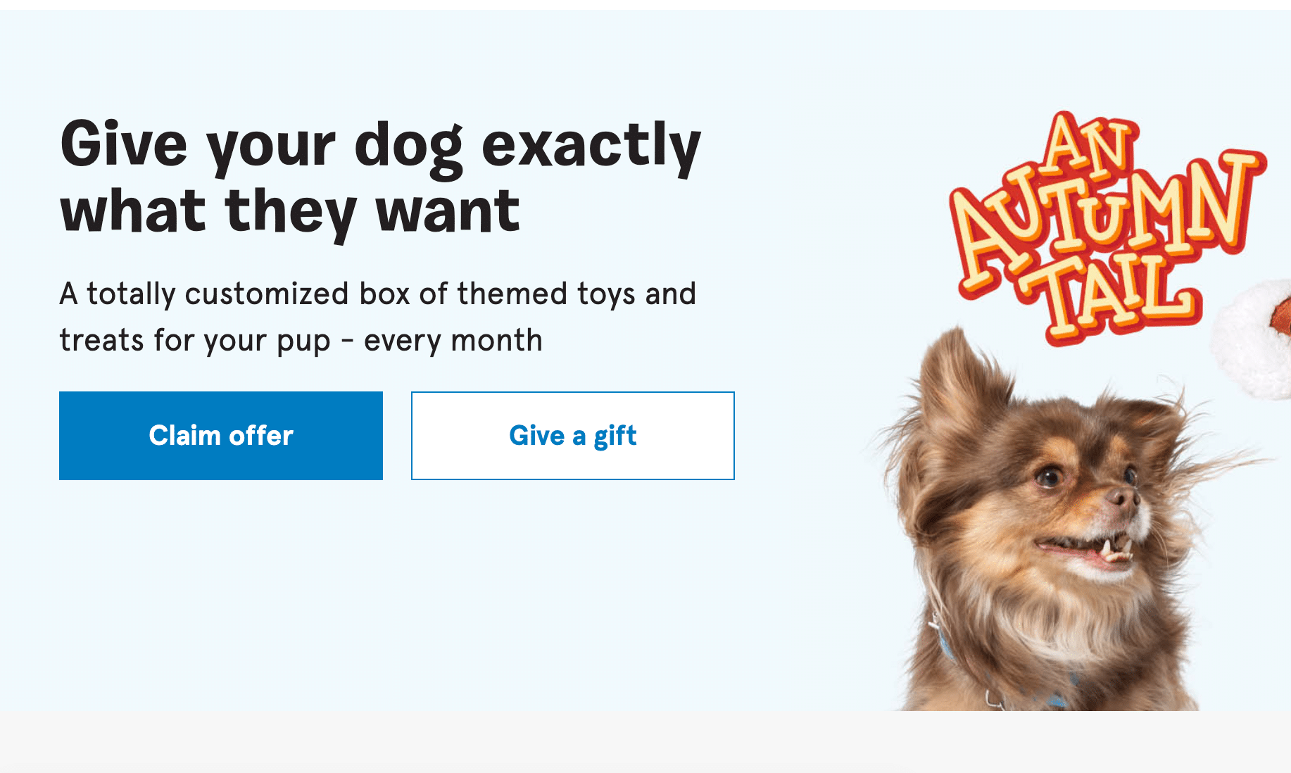
Source: barkbox.com
If they were to highlight only one of these options on their homepage, they would certainly risk losing some of their customers. This way, they have all of their bases covered.
Mind Your Background
The background you place your CTA on is sometimes equally important as what you choose to write.
Placing CTAs on a simple white background somewhere near the bottom of the page can work well. After all, you don’t need to feature a background image everywhere, and you will most often place one in the hero section only.
However, when you are adding your CTA to the hero, you want the image to play off the CTA and vice versa, so you can achieve a powerful synergy of visuals and text.

Source: theadventurejunkies.com
A very good example of the effect we’re referring to is on the Adventure Junkies homepage. It has a captivating image supporting the message of the CTA, which makes you want to get out there and have your very own adventure.
[insert page=’7-boring-seo-tasks-that-can-be-automated-to-save-you-time’ display=’single-related-article.php’]
Establish a Connection
The relationships you build with your leads and customers are what ultimately count. And if you can start that relationship off on the right foot with something as simple as a CTA – you truly will be the master of your marketing.
This tactic may not be relevant for every brand, and some might be able to utilize it more easily than others. The trick lies not only in speaking the language of your customers but also in showing them who you are, what you stand for, and how you can help.
Let’s explain the point with an example. EPIC’s homepage features a CTA at the very bottom, in what is essentially the contact section.
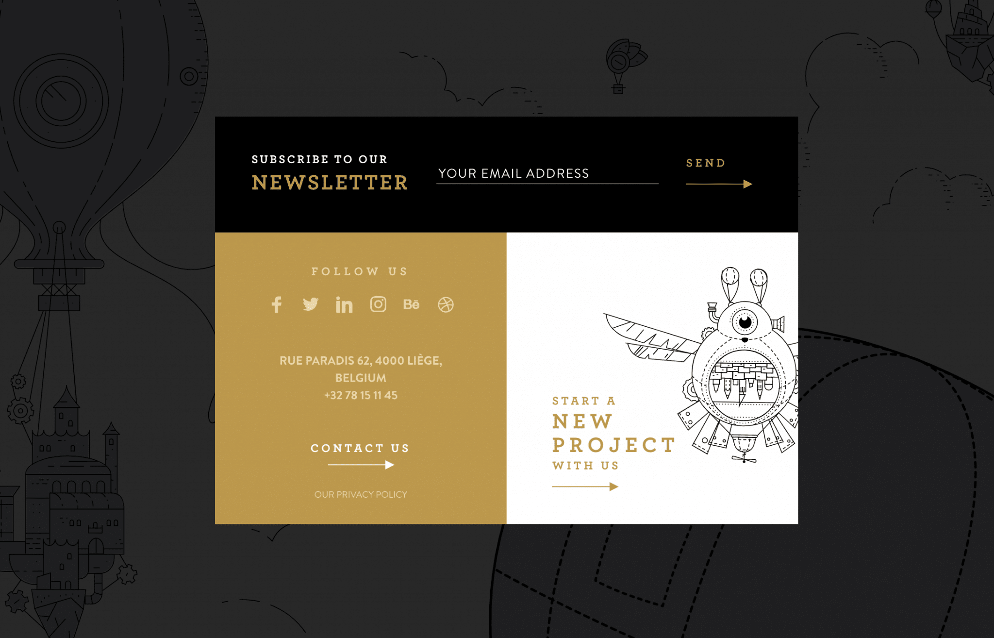
Source: epic.net
The CTA reads, “Start a new project with us” – and they have also used a “Let’s start a new project together” before.
The words “us” and “together” are what emphasize the connection. In this case, you (the client) and them (the agency) are in this together, and you will be jointly working on achieving your goals. Works really well.
To Sum It Up
Designing effective CTAs will come down to knowing as much as you can about your target audience, singling out a message you want to communicate, and distilling it down to a couple of effective words. There is, of course, the design element as well, where you should always try to make your CTA stand out, but not overdo it.
Get ready for some brainstorming, and use our tips and examples to help you work out an effective CTA of your own. And now, the stage is yours!