Content distribution networks are plagued by the inability to target. In theory, distribution networks make relevant content recommendations based on the original article. But often times that’s not the case, making measuring native advertising campaigns all the more challenging . Let’s look at this idea in more detail.
The Inefficiency Of Content Recommendations
Have you ever read an article about food and then been served a “recommended” article about celebrity gossip? All too often, this makes it hard to trust these networks as valued marketing channels since we can’t target our audience.

While this crutch affects the efficacy of our campaigns, it doesn’t mean we can’t learn from what did or didn’t work. As I have previously discussed, CTR’s aren’t a reliable way to measure success. Instead, we should look at the ads that drove the best quality traffic and adjust our campaigns accordingly.
While other channels like paid search and social media enable advertisers to target a specific audience (and thus garner higher quality traffic), content distribution networks don’t know who they’re serving content to, nor how well they are truly engaging with it.
The inefficiency of native advertising platforms is also comparable to that of display networks. Back in the day, display was great at urging people to take action… until they got sick of digital billboards. Then, display networks upgraded their abilities with remarketing and other demographic targeting features.
Sound familiar? Native advertising continues to lack those demographic targeting abilities, so we are repeating history in this channel. Instead of being caught on the wrong side of history, here is how we can make the most value out of your native advertising campaign.
Maximizing Value In Native Advertising
We can quantify the effectiveness of native advertising in two dimensions. One dimension is the advertising metrics measuring the efficacy of the ad itself – did the audience actually engage with this ad?
The other dimension is the engagement metrics assessing how people engaged with the “product” after viewing the ad. In theory, those who clicked on the ad were qualified, but how can we find the ads that generated the most amount of qualified traffic?

In order to do this, we must assume that all advertising metrics are the same. By that, I mean the same methodology should be used to create each ad in your experiment using the same styled stock photo, original article title, and description. This normalizing of the ad creative process allows for a control variable to see what the content engagement metrics truly look like. Ultimately, though, the ads are served up by the platforms are based on their click through algorithms.
Content Engagement Metrics
From there, look at the content engagement metrics to determine how successful the ads were. Remember that native advertising, much like display, is not meant to be a last touch attribution of conversion and thus spends more time assisting conversions.
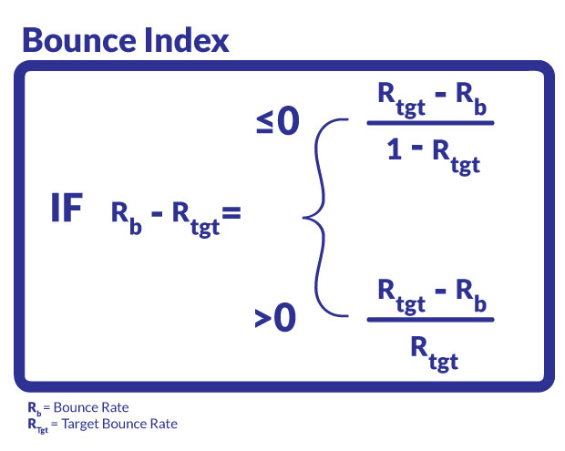
Understanding how users interacted with your content in response to their own expectations is best represented with the bounce rate. Typically, users will bounce from a page if the article served up doesn’t meet their expectations from the title. This often happens when articles that appear to be very in-depth are actually short, shallow content, or when the title severely misleads users.
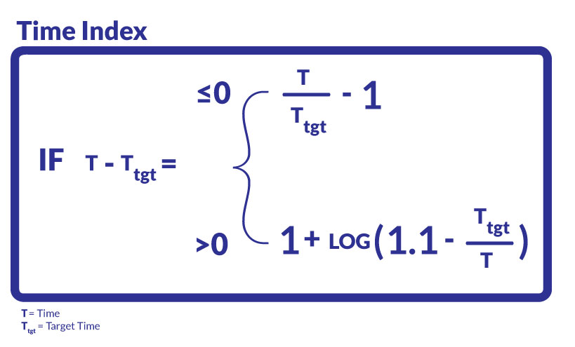
Understanding how users engaged with your site after reading the content is determined by the time on site and pages per visit. For simplicity, we will choose time on site as our metric of analysis of site engagement.
To recap:
- Bounce rate measures expectations
- Time on site measures engagement
Indexing Content Engagement Metrics For Analysis
Now that we have determined our two engagement metrics, we want to be able to rapidly discern the ads that are successful at meeting expectations and engrossing readers.
Normally, we compare ads against their average performance in each of the metrics we choose to track. But even looking at two metrics per article can quickly get out of hand when you have 50 articles to evaluate.
In order to streamline this, we can create indexes of success for each component by weighting each article from -1 to 1 for each metric. We apply these calculations to create an index for bounce rate and time spent.
Note: I’ve already created a free template that has these equations built into a spreadsheet so you can just plug and chug. Get it here.
Making the assumption that we care equally as much about bounce rate as we do time on page, we will evaluate these metrics on a 50/50 basis of each index. If you value one engagement metric more than the other, you can weight bounce rate higher than time on page, or vice versa.
By taking 50 percent of the weights, then, we can combine them to find the “engagement index,” which will range from -1 to 1. This gives us one standardized score, which allows us to quickly sort content that’s performing best to worst and look at the magnitude of how good or bad they are.
The Content Promotion Quadrant
As great as this is, looking at content ranked by just one index is limiting; there is actually more value in looking at multiple indexes in comparison with one another since we defined one for engagement and the other for expectations. By performing quadrant analysis on bounce index and time index, we can really start to analyze the type of traffic that each article generates.

- Best Content: High Bounce Index, High Time Index means that users who came to this content did not leave the site immediately and consumed the content in-depth. This is an ideal type of engagement, and thus advertisement.
- Gateway Content: High Bounce Index, Low Time index means that users who came to this content engaged quickly and moved on to explore the site. This either means that the content was short and easy to consume or the content helped trigger users to move elsewhere in the site because the content quickly matched their needs.
- Niche Content: Low Bounce Index, High Time index means that users who came to this content engaged heavily, but only a small fraction of people did. This usually means that the content was too in-depth to grasp quickly or that people needed to come back to it. While not ideal for promotion, this type of content is very good for the specific niche and can perform well in earned media or referral campaigns.
- Poor Content: Low Bounce Index and Low Time index means that users who came to this content left the site quickly and didn’t spend a long time reading anything. This is not ideal content for promotion but does not necessarily mean that it is bad content. You should evaluate the promotion metrics against the organic metrics to see if there was a major difference in consumption before deeming the content bad.
Start Optimizing Your Native Ad Campaigns Today
As mentioned earlier in the article, I’ve already created a free template for you to measure and optimize your native ad campaigns by simply plugging in a few numbers. Click the icon below to download your free Content Promotion Quadrant template.
Scoring your content is an invaluable way to research what to produce next or what types of content work well for promotion. Digging deep into each of these quadrants lets you find commonalities between the content pieces and helps find the right content for the right need. Just because we can’t target, doesn’t mean we can’t get value out of the traffic that helps support content creation.