Taking your photo, you are aware of various things that are making up your shot. They are lighting conditions, angle of view, perspective, camera settings, etc. The weather conditions as well as the surroundings in general, like the features of a landscape, architecture details if they are present around there can always make you improvising and looking for the best solutions. One more factor is the color palette present in the frame of your shot. If it is appropriate, then it will pay off.
Taking all the concepts about the proper composition as the basis of one’s approach, a beginner artist can easily miss the point with the colors within the frame. So, have some time for reflection on how the elements within a single photograph contribute to the color spectrum, thus forming a certain mood and impression.
[bctt tweet=”The colors influence the viewers, pushing them to some emotional feedback, even though you might not be aware of this particular color palette.” username=”relevance”]
So, all the photographers are looking for ways to find a color for power.
As always, there is an elaborate theory around the perception of colors, but we are not going to get into details, but everyone knows that there are different ways the colors influence us. Some colors are making us calm and clear, some inspire us, yet other colors make us feel stable and prosperous. In this article, we would like to explore and appreciate the conscious and subconscious preferences photographers make and the symbolic content the chosen colors express. Color palettes drawn from photographs show a different view on photography but let it be an option to decide.
[insert page=’how-long-should-your-posts-be’ display=’single-related-article-02.php’]
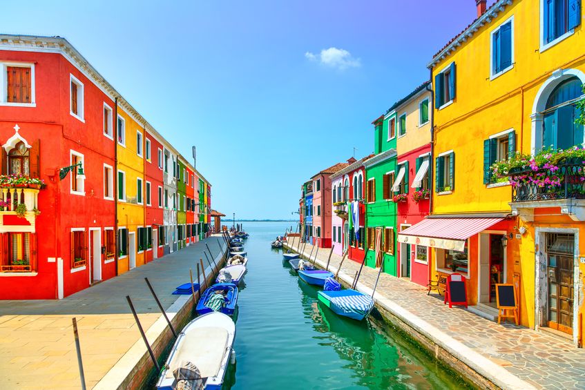
Orange
Orange is quite prominent against the lighter tones. Being a nice mixture of yellow and red, orange contains and expresses the characteristics of both colors. It shows love, desire, passion, and warmth. Orange brings vivid and fresh energy about it and represents energy and enthusiasm. As it is connected with fall, it’s a slight and subtle recall of the continuous seasonal changes in nature.
Pink
Its nature is delicate; thus, this color bears a certain vibration of feminity and its charms. It’s not a bold color of excitement; it is a smooth tint of a calming effect. Pink is a tender shade of love, romance, and gentleness. The hues of pink bring different associations and facets of fondness.
Brown
This color dominates in natural conditions, being both moderate and sweet in any variant.
It is directly connected with the ground and all things about nature itself. Some people think it is quite plain and dull color, but anyway it reminds us of the element of the earth, creating a feeling of stability and integrity of the world. Also, it is always visible and very much connected with the material side of being.
Red
Red color creates an explosion of feelings and associations. It brings a lot of contexts being the symbol of danger, action, passion, adoration, and adventure. People can easily associate it with bravery, courage, and dares. This color might evoke straight and direct emotional reactions. As it is very powerful, one should apply it in a very temperate and smart way. Small details of these colors create necessary contrast and surprise, grabbing the viewer’s attention and setting the mood intensively.
[insert page=’how-to-use-color-in-your-social-media-strategy’ display=’single-related-article.php’]
Green
This is another wide-spread symbol of positive changes we people are always eager to get and expect, but in the same way, it is very much related to natural and earthy vibes showing intensive growth and makes us experiencing harmony and good. It’s symbolism that can be traced to rebirth and peaceful, effortless evolution and transformation, as it takes place in nature. Some people find recreating and healing powers in it, so it is a peaceful element of a color palette. Green has numerous hues. A variant of the tint, Greenery, has been named the color of the year by Pantone.
Violet/purple
It also belongs to natural colors and can be found easily in nature. Even the sky sometimes shows a sort of its hue. Also, it is closely related to power, wealth, and exclusive states because of the intense saturation of the hue. Sometimes it can bring calm and be humble, even subtle hint at violet makes a photograph soother.
White and grey
All people can easily connect white with purity, clarity, higher spiritual states, lightness, and transcendence. Its non-aggressive, encompassing, and transparent character makes it very elegant and suitable as a neutral element of any structure. When it gets mixed with some black color, white turns into gray; it is even more neutral than white, even a bit moody color. Here it curious observation the lighter colors are related to femininity, and when mixed with black, they show masculinity. So, in these terms, grey is a color that combines the power of black and the transparent purity of white.
Blue
This color is very basic in human perception; as people see the sky and water as blue. So, again, it shows us something higher and bigger than us, something that can calm and give space. As it is soothing and is associated with strength and trust, blue gets applied widely in interior designs/ For instance, the blue walls set the mood and it is the color that creates the atmospheric undertones. Light blue brings experiences of peace and serenity while the darker tints of it are about strength and reliability. In ancient art, it was the symbol of heavens, again calling us now to experiences of peaceful power.
Black
Black is the color of possibilities, as well as the white. It is related to voidness, in-between states, strict and straight power, and fine elegance. Also, it is very basic in photography, creating contrasts, shades, backgrounds, details, which attract the viewer’s attention. Also, when black gets combined with bright colors like orange, it provides a visually appealing and dynamic experience.
Burgundy
Burgundy is such a rich color associated with royalty, nobility, and wealth. It emphasizes the lighter hues of orange and the basic dominance of black and white.
[insert page=’discover-the-20-top-social-media-tools-brands-are-using-to-beat-the-competition’ display=’single-related-article-02.php’]
Yellow
Yellow is the most visible color in the color palette. It is incredibly visible, and people perceive it before anything else in every picture. It’s a color of happiness, joy, wealth, optimism, the fruition of positive results, creative power, and energy. It’s the color of sunshine, warmth, and beauty. Different hues of yellow bring different impacts. Darker shades might enrich an atmosphere even with some dramatic effect while the lighter tones make things merry and happy.
So, the colors are powerful tools for creating an emotional structure of photographs. Besides the important things like geometrical composition and lighting, the colors add some additional symbolism and different layers of meaning to this complex art. So, let us all consider the reasonable and adequate application of colors in our shots. Correct color palettes bring out a deeper meaning in your images and result in a more powerful, emotional influence on your audience. Any picture might be entered into template frames, one should only choose an appropriate color palette for that.