Ever since search engines rose to prominence in the marketing world, the battle between SEO and website user experience (UX) has been raging, each championing their own priorities for web design. For website owners, taking into account the guidelines for search engine optimization and the best practices for a positive user experience can feel like serving 2 masters. After all, you want your site to be full of content and keywords to help search engines find you, but you also want your site to be easy to navigate and to convert visitors to customers. Is there a happy medium? Rest assured, solutions are at hand. Follow these 5 tips to balance the demands of SEO and UX on your site.
Appeal to Search Engines & Deliver a Great User Experience
1. Be Strategic with High-Level Messaging
High-level messaging on a web page typically refers to the headlines, subheadings and calls to action. This messaging has two functions. It anchors and guides your visitor’s attention through the site, and it also supports on-site optimization, so this is a great place to start.
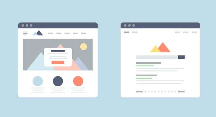
From a UX-standpoint, web designers use visual hierarchy, that is, they arrange the graphic elements in order of importance. The goal of visual hierarchy is to influence the order in which the human eye perceives information. Headline texts are typically in the largest font, with subheadings in slightly smaller fonts. This helps a web visitor to process information quickly as they scan the page.
From an SEO perspective, the main headline on a web page is typically the H1 tag. H1 is an HTML tag that indicates a heading on a web page to the search engines. Before working on your high-level messaging, do some keyword research and think about the focus of each page. Be strategic and include keywords in your headline, while keeping the language clear and accessible. Your visitors will be able to tell the difference between useful, informative headlines and overstuffed, keyword-laden headlines just for optimization purposes.
[insert page=’leverage-ux-best-practices-to-10x-your-conversions’ display=’single-related-article-02.php’]
2. Present Content in Creative Ways
One of the big battles between SEO experts and UX strategists is over the amount of content to have on a web page. You need enough content so that the search engines can understand what the page focuses on, but you also need to be clear and concise enough so that your visitors stay engaged.
If a particular page calls for a lot of content, get creative about where and how you place the information. On your home page, the first 4-5 panels or sections of the page should correlate to the most important pages of your site. Because web visitors tend to scroll on websites, it’s common for a visitor to scroll through the home page and use it as a gateway into the internal pages. After these key panels on the home page, add a few more sections with less essential but useful content in order to increase the amount of content on the page.
On internal pages, a Frequently Asked Questions panel with an accordion is a great way to add more content while keeping a web page clean and easy to read. An accordion hides the answer to a question and only opens up to reveal the answer when a visitor clicks on the question or a plus symbol. It’s not only a user-friendly solution but keeps the content searchable to search engines as well.
3. Create a Clean Navigation
A clean, intuitive navigation is a critical part of creating a positive user experience on a website. If a web visitor has a difficult time navigating the website, it’s unlikely that they’ll stick around. In the past, websites were designed with lots of pages in the navigation because visitors were viewing sites on desktops and didn’t mind clicking through drop down menus.
Today, the majority of visitors view websites on smaller devices and expect to find what they are looking for as quickly as possible. For your SEO goals, you may want lots of pages on your website – but you don’t necessarily need all of those pages in your navigation. Avoid having lots of drop downs in the menu; they’re especially difficult to navigate on smaller devices.
If you have a larger site and need to showcase lots of service or product pages, consider adding a mega menu to the navigation. There are different types of mega menus and they offer a more expansive drop down interface for visitors.
[insert page=’elevate-your-websites-ux-with-these-personalization-tactics’ display=’single-related-article.php’]
4. Use Your Blog
Having an active blog supports both SEO and UX. From an SEO standpoint, a blog is an easy way to add new content to your website on a consistent basis, which search engines value. Strategically creating long-form articles focused on certain keywords also supports search engine rankings, as does linking internally between different blog posts on your site.
On the UX side of things, a blog is a visitor-friendly tool for organizing information. Rather than putting content into tons of pages that are difficult to find and navigate, place this content in blog posts. You can organize your information by categorizing the blog posts and adding tags. Implementing a search field for your blog is another way to help visitors easily access the information they’re looking for.
Lastly, video blogs are a great way to generate consistent posts. You can film several videos at the same time and then post each one separately. However, make sure that you write and post the transcription of the video along with embedding the video file. Search engines aren’t able to crawl videos, so you need to include the transcript.
5. Focus on Mobile

The mobile user experience is one area where SEO and UX are slowly converging. In 2016, Google announced mobile-first indexing, which means that Google predominantly uses the mobile version of your website for indexing and ranking. Mobile-first indexing is now extremely prominent, so you need to consider the mobile experience of your site for both SEO and user experience.
For this reason, it’s important to add content in strategic ways that optimize the mobile experience of your site. When designing your website, work with a web designer that is skilled with mobile-wise design.
A mobile-wise approach factors in how all the content, images and elements look on different device sizes from the outset. The placement of objects and the use of white space are both critical on mobile because visitors tap buttons or links with their thumb. If objects are too close together, your site will be difficult to navigate on a smaller device.
Finally, we’ve all seen people walking and looking down at their phone. Creating an intuitive navigation and experience is so important on mobile because your visitor’s attention may be fragmented while they try to navigate the site.
[insert page=’why-a-free-seo-tool-junkie-finally-joined-the-paid-club’ display=’single-related-article-02.php’]
You Can Achieve a Balance
In the end, a little bit of forethought is all you need to resolve the battle between SEO and UX.
With clear, SEO-savvy messaging, a robust blog, and clean mobile-wise navigation and content layout, you can satisfy both SEO protocol and maintain a friendly and accessible UX.
By focusing on these 2 elements, you can not only improve your search engine results but also engage and convert the traffic in the end. There’s no need to divide your loyalty between the two goals. Properly balance your SEO and UX, and you can have it all.