Infographics are loved by marketers for their ability to communicate complex (and often data-intensive) ideas very quickly and in a visual way. This is good because 90 percent of information transmitted to the brain is visual.
And according to Unbounce, demand for infographics has increased rapidly in recent years.
But there’s a right way and a wrong way to make an infographic, and there are countless theories about the best techniques for making a shareworthy infographic. Here are five such ways to make your infographic stand out:
1. Write Better Headlines
Headlines play a vital role in online marketing. Whether for an article or an infographic, a headline should have some impact on the reader. If your headline isn’t attention-grabbing, good luck getting viewers to read the rest of your infographic.
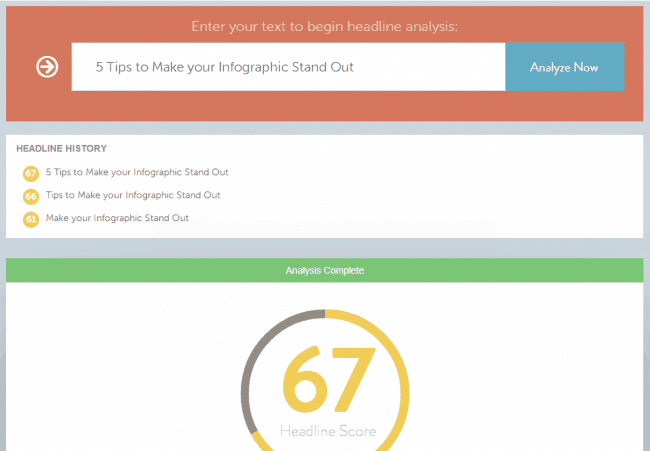
As with most functions of marketing, a variety of tools exist to help you write the perfect headline for your infographic. My favorite is the CoSchedule Headline Analyzer tool and I recommend a headline score of at least 60 for an infographic.
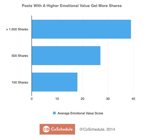
 You also need to check your headline’s emotional value. According to CoSchedule, posts with a higher emotional value get more shares.
 2. Provide Unique Value
It is very important to provide unique value to your readers. Make sure your infographic is truly helpful to the intended audience.
With so much information available on the internet, providing real value is one of the toughest tasks a modern marketer faces. Merge information and data from a variety of sources and present it in your infographic in a special way with a unique slant.
It should go without being said, but providing unique value doesn’t mean that you can add false facts and figures. Always check (and double-check) to ensure your facts, figures and data are correct and your sources are reliable.
3. Choose a Goal
Without a specific, pre-defined goal, your infographic will be ineffective. No matter how cool your design is or how much data you have compiled, your infographic will not serve it’s purpose if it doesn’t revolve around a relevant and interesting theme. And, with a specific goal in mind, it becomes easier to segment and target your intended audience.
4. Effective Design
Effective design means making your infographic simple and useful.
- Leave enough blank space so that the text and data are readable.
- Be consistent and limit the variety of fonts.
- Maintain a logical flow from section to section.
- Do not use too many colors. (To understand more about colors, read this post by Neil Patel on color Psychology.)
- Choose the right size for your infographic.
5. Shareability
You didn’t put all the time and effort into research and design of your infographic, just to have it sit idle on a webpage, did you? Of course, you didn’t, which is why you also have to simplify and streamline the sharing process. Here are a few best practices to remember:
- Add an embed code below your infographic.
- Optimize for both size and resolution. Infographics should load fast and should not be pixelated.
- Include a Facebook-ready image in your blog post for optimal sharing that doesn’t sacrifice the visual quality of your work.
- Don’t forget to cite sources at the end of your infographic.
- Use the word “Infographic” in the blog post that hosts the infographic. This attracts readers and increases social shares because infographics are inherently easier to consume than paragraphs of text.
- Tweet it to influencers in your niche and ask them to help spread the message.
- Always include a call to action at the end of your infographic.
- Consider writing a social media release if your infographic is truly share-worthy.
Building great infographics is often a process of trial and error and learning from your mistakes, but that doesn’t mean you’re doomed to a future of stagnant, boring content that no one wants to share or talk about.
By following these tips (and grabbing these ebooks for additional advice and guidance) you prioritize design and user experience over any other potential benefits, which confirms you’re making infographics for the right reason in the first place: to help users solve a problem that you have the answer to.