When you think of content, you might only think of text, but content really includes everything that your intended audience sees. Images, colors, and even the fonts you use all impact your content and affect your readers or viewers psychologically. That is why today, we are taking a look at how you can bring your brand influence to your readers or viewers through your choice of color fonts, and images in your content, and branding.
The secret psychology of images in your content
Pictures are a big part of content. Even though you may think of images as just something extra that you add to your text, psychologically, they are much more than just an accent. People are visually-oriented, as half of the human brain is dedicated to visual processing. Images will not only bring your content and branding to the next level but will help your branding and message be remembered. These statistics show how and why people respond better to images and process them faster than text alone.
- 90% of information transmitted to our brain is visual.
- Presentations with visuals are 43% more persuasive.
- 65% of us are visual learners.
- 93% of all communication is nonverbal.
- Colored visuals increase people’s desire to read content by 80%.
- Content and branding with images increase a view rate by 94%.
- Posts with images produce 180% more engagement.
- People are 85% more likely to buy your product after watching a video about it.
- It’s easier for people to process images, compared to text.
- 90% of information transmitted to the brain is visual.
- 60% of the population are visual learners.
- Images are processed simultaneously.
- Text is processed sequentially.
- Visuals are processed 60,000 times faster than text alone.
- Most people only remember 20% of what they read.
- Publishers who use infographics grow in traffic an average of 12% more.
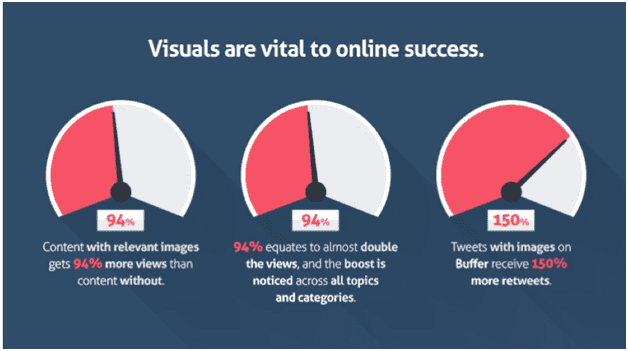
Image source: QuickSprout com
- Content with relevant images gets 94% more views than content without.
- 94% equates to almost double the views, and the boost is noticed across all topics and categories.
- Tweets with images on Buffer receive 150% more retweets.
When you are selecting colors for your brand, choose a palette and consistent methodology so that your images are reflective of your brand and easily recognized as such. Remember to choose relevant images that help get your message across. Refrain from using common stock images just for the purpose of including an image.
Does psychology affect how people view fonts?
Fonts are often used in images, logos, and other images. The font can make or break your image and can even influence how people feel about your message. Fonts can make a bigger impact and draw out an emotional response.
The font you choose can impart different feelings or ideas. This is because of the psychology of typography:
Serif fonts are associated with authority, tradition, respect, and grandeur.
- Popular Serif Fonts: Times New Roman, Bodini, Georgia, Garamond, and Baskerville.
Sans Serif fonts are associated with being clean, modern, objective, stable, and universal.
- Popular Sans Serif Fonts: Helvetica, Verdana, Arial, Century Gothic, and Calibri.
Slab Serif fonts are associated with bold, strong, modern, solid, and funky.
- Popular Slab Serif Fonts: Rockwell, Courier, Museo, Clarendon, and Bevan.
Script fonts are associated with being feminine, elegant, friendly, intriguing, and creative.
- Popular Script Fonts: Lobster, Zapfino, Pacifico, Lucida, and Brush Script.
Modern fonts are associated with exclusivity, fashionable, stylish, sharpness, and intelligence.
- Popular Modern Fonts: Infinity, Eurostyle, Majoram, Matchbook, and Politica.
When you think of it like this, it helps get the message across. What does each message make you feel?
 vs.
vs. 
This example of two different fonts saying, “I love you”, really drives home the point of how a font can make you feel and how each font conveys a message. Similarly, if you were to use a Halloween font, it changes the message. The same can be the case if you choose a comical or whimsical font to try to relay a serious message.
The psychology of color in your content and branding
Just like fonts help add to the imagery of your text content, color has a big impact on the psychology of your written word as well. Colour helps call attention to your text, but you may not realize that colors also evoke emotions. Here are the different feelings that colors can make your audience feel.
- Blue: Trust and Security, Calmness, Peace & Honesty, often used by banks
- Green: Associated with wealth, Easiest color for the eyes to process, often used to represent health and wellbeing
- Yellow: Optimistic & Youthful, Fun, Humour, Lightness, Intellect, Logic, and Creativity
- Orange: Stimulates Creativity & Productivity, Creates a Call for Attention
- Red: Creates urgency, vitality & stamina, energy
- Pink: Romantic & Feminine, Often Aimed at Girls or Women
- Purple: Soothe & Calm, Intuition & Imagination
[insert page=’how-to-use-screen-recording-videos-in-your-content’ display=’single-related-article.php’]
Summary and Takeaways for Your Company
Hopefully, now you understand how important images, fonts, and colors are. When it comes to your content, mixing it up with images, fonts, and colors in addition to text can help drive home your meaning and gives feeling and emotions that are impossible to have with plain text alone. Understanding just a bit of the psychology behind these aspects of content can make it that much easier to drive your point home to your audience. The important takeaway to remember when it comes to branding is that you still need to establish a palette and color set, or style for your fonts, colors, and imagery so that it becomes recognizable as your own.
Frequently Asked Questions
When visuals and design choices are intentional, they can make your message easier to recognize, remember, and feel.
How does color psychology influence branding?
Color does more than decorate a brand—it can call attention to text and evoke emotion. Different colors are commonly associated with specific feelings: blue with trust and security, green with health and wellbeing (and it’s described as the easiest color for the eyes to process), yellow with optimism and creativity, orange with creativity and productivity, red with urgency and energy, pink with romantic and feminine themes, and purple with soothing calm and imagination. Using a consistent palette helps make brand visuals easier to recognize.
What is the psychology behind fonts?
Typography can shape how people feel about a message, and the same words can seem to carry different meaning depending on the font. Serif fonts tend to feel authoritative and traditional, while sans serif fonts feel clean and modern. Slab serif fonts often come across as bold and strong, script fonts feel more elegant or creative, and modern fonts can feel stylish and exclusive. Because fonts can trigger emotional responses, they can support—or undermine—the tone you’re trying to convey.
What is the role of typography and color theory in effective branding?
Typography and color work together to create emotion, clarity, and recognition. Fonts help set the tone of your message—serious, friendly, modern, or traditional—while color draws attention and adds emotional meaning. When you pair these with consistent imagery, your content becomes more cohesive and easier to identify as yours. A clear palette and a defined approach to fonts, colors, and imagery helps audiences recognize your brand and connect your visuals to your message.
Give examples of font and color choices for different industries
Some common pairings come directly from the emotional associations described for color and typography. Banks often use blue because it’s linked with trust, security, calmness, and honesty. For health and wellbeing, green is frequently used and is described as easy for the eyes to process. On the typography side, serif fonts can support brands that want to feel traditional or authoritative, while sans serif fonts can support brands aiming for a clean, modern look. These examples work best when used consistently across branding.
How can a small business choose the right colors and fonts for its brand?
Start by choosing a color palette and a consistent methodology so images and designs look like they belong to the same brand. Pick colors based on the emotions you want your audience to feel, and select typography that matches your message—serious, playful, elegant, modern, or bold. Keep your imagery relevant to what you’re communicating, and avoid relying on common stock images just to fill space. Consistency across fonts, colors, and visuals makes branding easier to recognize.
How do images affect content and branding psychologically?
Images are processed quickly and can make content more persuasive and memorable. Visuals are described as a major part of how people process information (including the claim that a large portion of the brain is dedicated to visual processing), and several examples highlight stronger performance for visual content—such as higher engagement and view rates when posts include images or video. To support branding, choose relevant images that reinforce your message and use consistent colors and visual style so your content looks recognizable.