If you have ever shipped a “simple UI update” that quietly tanked conversion, you already know the uncomfortable truth: interface design is a growth lever, not a coat of paint. The pressure makes it worse. Stakeholders want a refresh, users want speed, engineering wants fewer edge cases, and you want the numbers to move without rebuilding the whole product. Good UI work is mostly constraint management, plus ruthless clarity about what the user is trying to do in this moment.
Here are eight factors that keep you grounded in outcomes, not opinions, when you design or redesign an interface. (And yes, they matter even when you are “just tweaking the layout”.)
1. User intent and the job they hired your UI to do
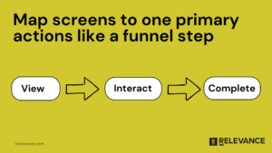
Start with the user’s job to be done, not your sitemap. When someone lands on a screen, they are trying to make progress: compare plans, find a file, book a slot, finish checkout, get an answer, feel confident. If you cannot say what “progress” looks like, your UI will default to pleasing internal stakeholders and confusing real people. In practice, the fastest wins come from mapping one screen to one primary action, then measuring it like a funnel step (view → interact → complete). If the screen serves multiple audiences, be honest and separate flows instead of forcing one “universal” layout that satisfies no one.

2. Information hierarchy that respects how people scan
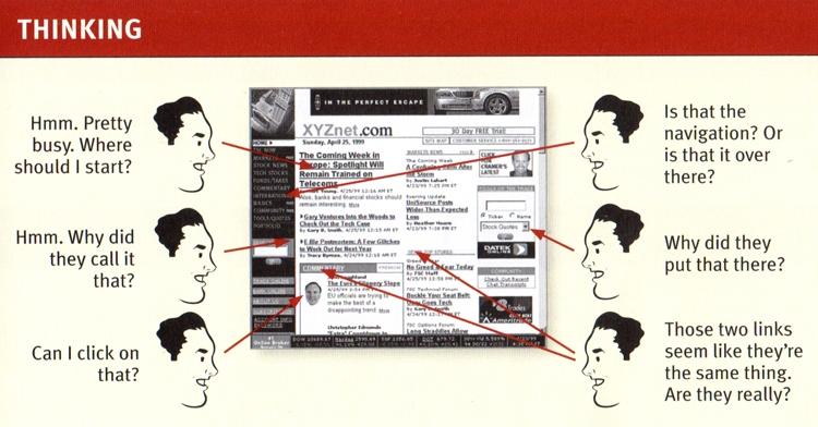
Most interfaces fail at the same boring place: everything screams at once. Establish a clear visual hierarchy so users can answer three questions in seconds: Where am I? What can I do here? What happens if I click that? Steve Krug (author of “Don’t Make Me Think”) built a whole career on this because it keeps proving true. Your hierarchy is not just typography. It is spacing, grouping, contrast, and when you choose to not show something yet.
A useful gut check: if you blur the screen or zoom out, the “next best action” should still be obvious.

3. Friction budget and interaction cost
Every product has a friction budget: how much effort a user will spend before they bounce or defer. Your job is to spend that budget on the steps that create real value (verification, safety, thoughtful choices) and cut it everywhere else. This is where teams accidentally sabotage themselves with “nice to have” fields and modal chains. One example from a B2B onboarding flow: collapsing optional fields behind “Add details (optional)” and moving terms acceptance closer to submit lifted completion by 12% in a week, with no new features, just better sequencing. The principle is simple: ask only what you will use immediately, and earn the right to ask for more later.
4. Feedback, system status, and confidence cues
Users do not rage quit because something is slow. They rage quit because they do not know what is happening. Strong UI design makes state visible: loading, saving, success, failure, progress, and what happens next. Jakob Nielsen (Nielsen Norman Group) has long emphasized visibility of system status for a reason: it is a trust mechanic, not a flourish. Use plain language microcopy, show progress when waits are non-trivial, and confirm actions that have consequences. If you want to reduce support tickets, churn, and duplicate submissions, invest here. It is one of the rare UI improvements that helps every cohort.
5. Consistency that enables speed (for users and your team)
Consistency is not about aesthetics. It is about predictability. When buttons behave the same, forms validate the same way, and navigation patterns repeat, users stop relearning your product on every screen. You also ship faster because your team is not reinventing components. This is where a lightweight design system pays for itself: fewer one-off decisions, fewer QA bugs, and cleaner experimentation because you can isolate variables. If you are resource-constrained, start small: define your core components (button, input, modal, toast, table states) and document “when to use” rules. You will feel the velocity improvement within a sprint or two.
6. Accessibility as a conversion multiplier, not a compliance chore
Accessibility is often treated like a checkbox at the end. That is backwards. When you design for contrast, readable type, keyboard navigation, clear focus states, and error messaging that does not rely on color alone, you make the UI easier for everyone, including tired users on bad screens in bad lighting. It also makes your product more resilient across devices, browsers, and real-world conditions. The growth angle is straightforward: clearer interfaces reduce misclicks, reduce form abandonment, and improve task completion. If you track drops by device type or demographic proxies, accessibility work frequently shows up as “mysterious” lifts in segments that were quietly struggling.
7. Performance and perceived speed
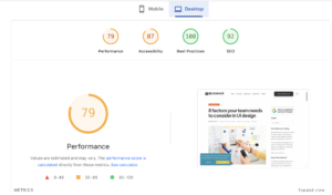
Performance is UX. Users experience latency as uncertainty, and uncertainty kills action. You can do a lot even when backend work is hard: prioritize above-the-fold content, avoid layout shifts, use skeletons for predictable loading, and keep interactions responsive even if the final result takes longer. This is also where UI design connects directly to acquisition and retention: a faster, calmer interface improves activation and reduces the “first session regret” that shows up later as churn. The same principle shows up in growth work more broadly: when teams invest in technical optimization and user experience, they often change the trajectory of a channel, not just a screen. One of our clients, Nurx paired technical optimization with trust-building content and grew organic traffic 49.7% year over year, while organic acquisition share jumped from 4.8% to 28.7%.

8. Error prevention and recovery paths that treat users like humans
Errors are inevitable. The design question is whether your UI punishes people for being human. Prevent errors where you can (constraints, sensible defaults, inline validation), but also design graceful recovery: clear messages, specific fixes, and “undo” when possible. Avoid vague copy like “Something went wrong” unless you also offer a next step that actually helps. If you care about conversion, this is non-negotiable. A surprising amount of funnel loss sits in edge cases: password rules, address formatting, payment declines, expired sessions, and timeouts. Fixing recovery UX often lifts completion without touching traffic or pricing, which is exactly the kind of win lean teams need.
Closing thoughts
UI design gets easier when you stop treating it like taste and start treating it like throughput: reduce confusion, reduce effort, increase confidence, and measure the result. Pick one critical flow, instrument it (Mixpanel, GA4, Amplitude, whatever you have), watch real sessions, and ship the smallest change that removes a known point of friction. Then iterate. That is how sustainable products improve, even with limited time and headcount.


